Getting Creative With Colour
Working with clients that are getting their homes ready for sale and offering my design thoughts is something I always find great joy and satisfaction from. But, often that advice is more focused around small cosmetic changes or where money is best spent around their property to get it ready for the market. It’s not often that a client trusts me to help with more bold aesthetic choices like paint colours, but with our new listing at 99 Pirie Street, this is exactly what happened.
With our client looking to repaint the interior and exterior frontage of her property for sale, she came to me with an exciting idea and asked my thoughts on getting a little creative with the paint colours used. Myself, Bella and Bridgett Popplewell (who impeccably staged 99 Pirie Street) were on the job, with paint swatches and plenty of ideas.
This was such a cool opportunity to help make what was already a beautiful little Mt Victoria cottage become a home that I can truly say I’m in love with! It was such a fun and rewarding process, selecting the paint colours and seeing our vision come together, and I think it really paid off.
So, in this week’s Journal, I wanted to share some of this process and the colour choices that we made. If you’ve been pondering a bold coat of paint somewhere in your own home, maybe this will inspire you to take the leap. At the end of the day, it’s only paint-so why not have some fun with it?!
The Green Facade
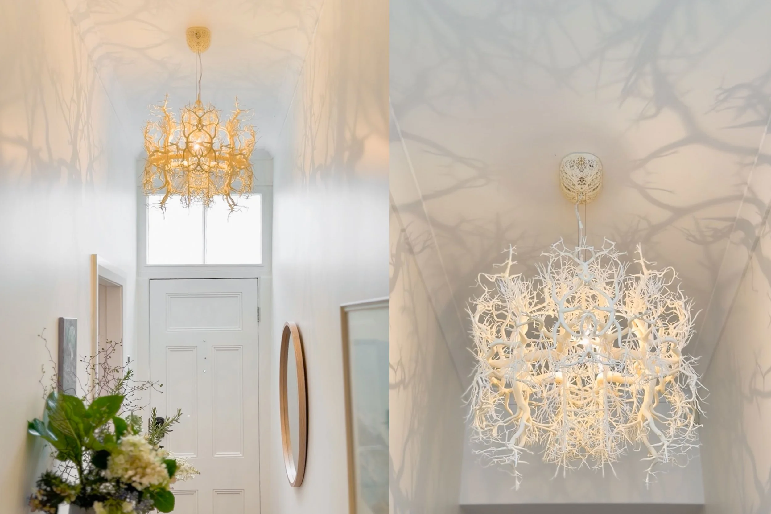
The inspiration for the colour story at 99 Pirie Street all started with the beautiful Forms In Nature light fitting that our client had installed in the entryway. This light fitting casts gorgeous shadows throughout the hallway and brings an overall feeling of nature becoming one with the home.
With this in mind, my initial thought was a shade of green for the exterior facade, something not too bright, but with the Town Belt off to one side and some mature griselinia hedges planted at the front of the property, green just felt right.
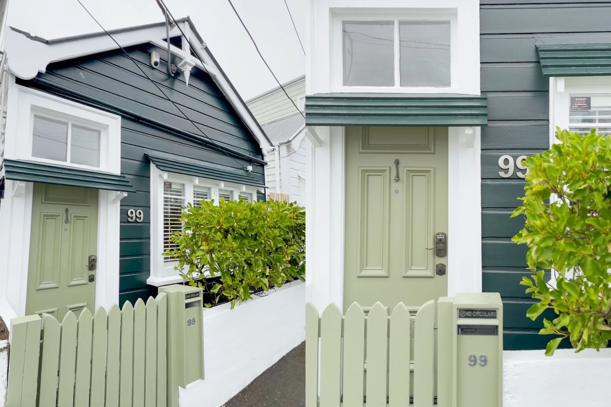
So, it was time to consult my collection of Resene paint swatches and create a shortlist. This paint selection felt like the most important one to get right, with the first impressions of potential buyers and the properties street appeal on the line. We ended up going with Resene Midnight Moss as the main paint colour and Resene Finch for the front door, gate and mailbox, with Resene Alabaster on the front fence and trims.
I could not be more happy with how it turned out! What was once a very cute Mt Victoria cottage, now stands out from the rest in all the best ways. The combination of Resene Midnight Moss and Resene Finch creates a lush, layered look that beckons you inside and definitely fits with the Forms In Nature theme.
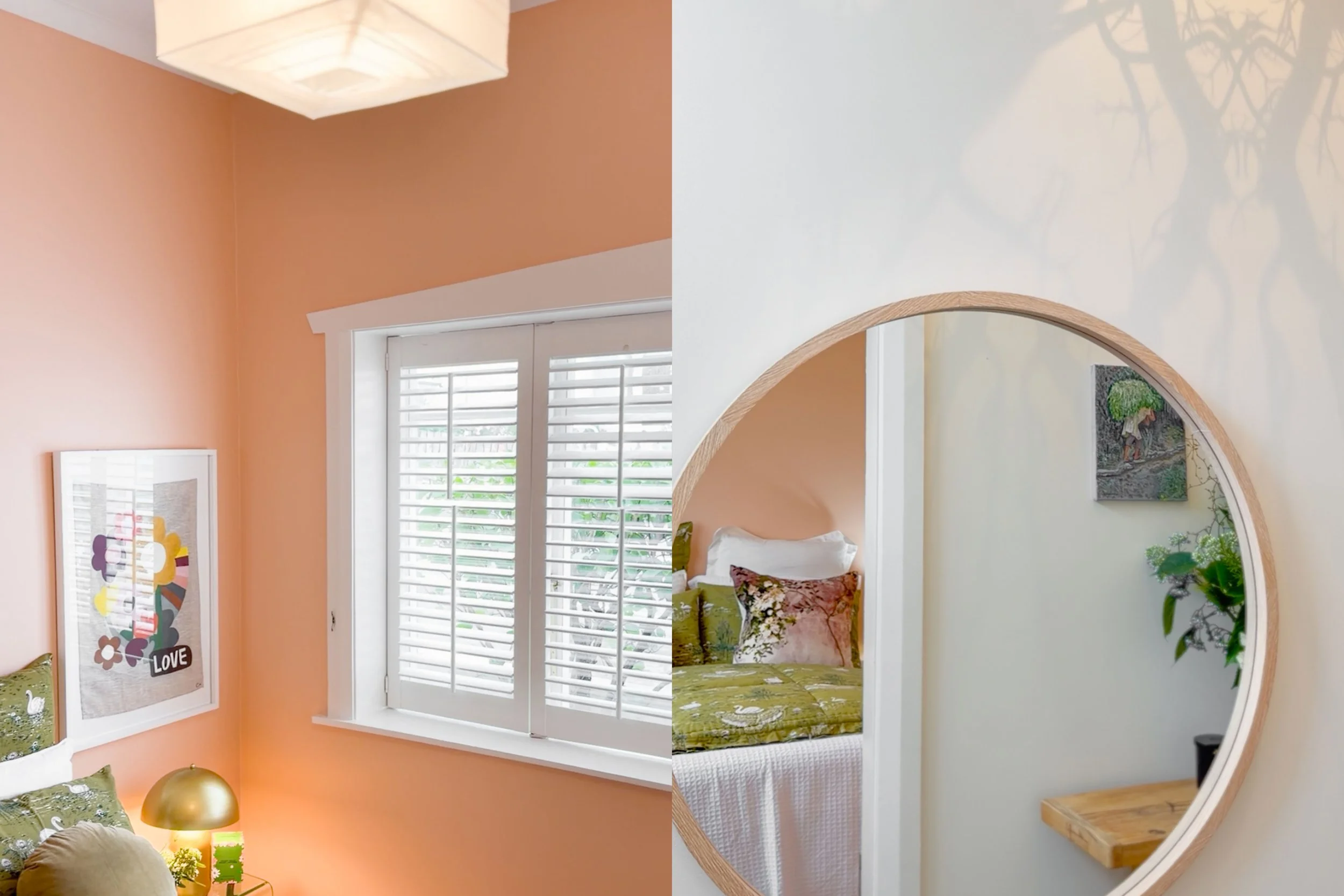
The Pink Room
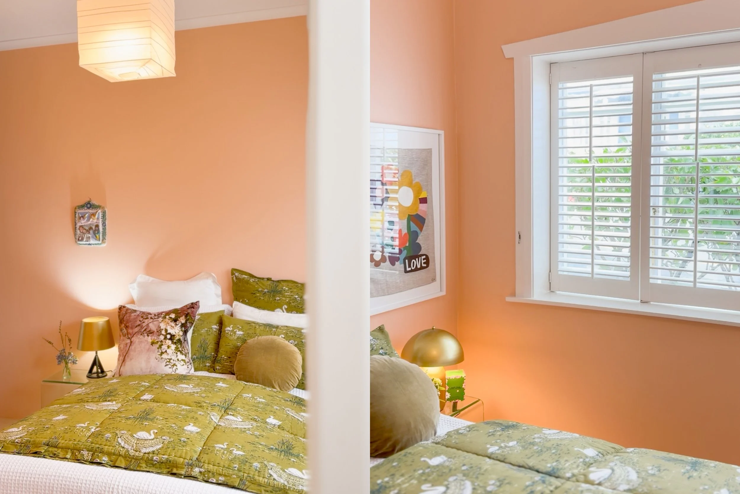
99 Pirie Street is a two bedroom cottage, the front bedroom enjoys privacy from the griselinia hedges outside and some gorgeous shutters over the windows. After a lot of pondering and back and forth, we decided that a bright shade in this front bedroom would really pop.
If you’re a regular reader of this Journal, you might know that we painted our back living room at home a beautiful shade of pink a while back, Resene Sakura to be exact. What felt like a risky colour choice at the time has brought us so much joy ever since and this decision definitely solidified my mindset around being brave with colour, life is short-why not!?
So, for the front bedroom at 99 Pirie, we landed on Resene Wax Flower which is a gorgeous shade of warm pink, we even painted the freestanding wardrobe and small walk-in closet the same shade, an (almost) complete colour drench.
The result is a bedroom that glows, with the warm pink tones pairing perfectly with the greenery outside the window and the green bedspread that Bridgett chose. What was once a simple bedroom, is now a colourful statement and it has the effect of bouncing the natural light around the room, to create what is a really special and inviting space. Pink for the win!
The Green Ceiling
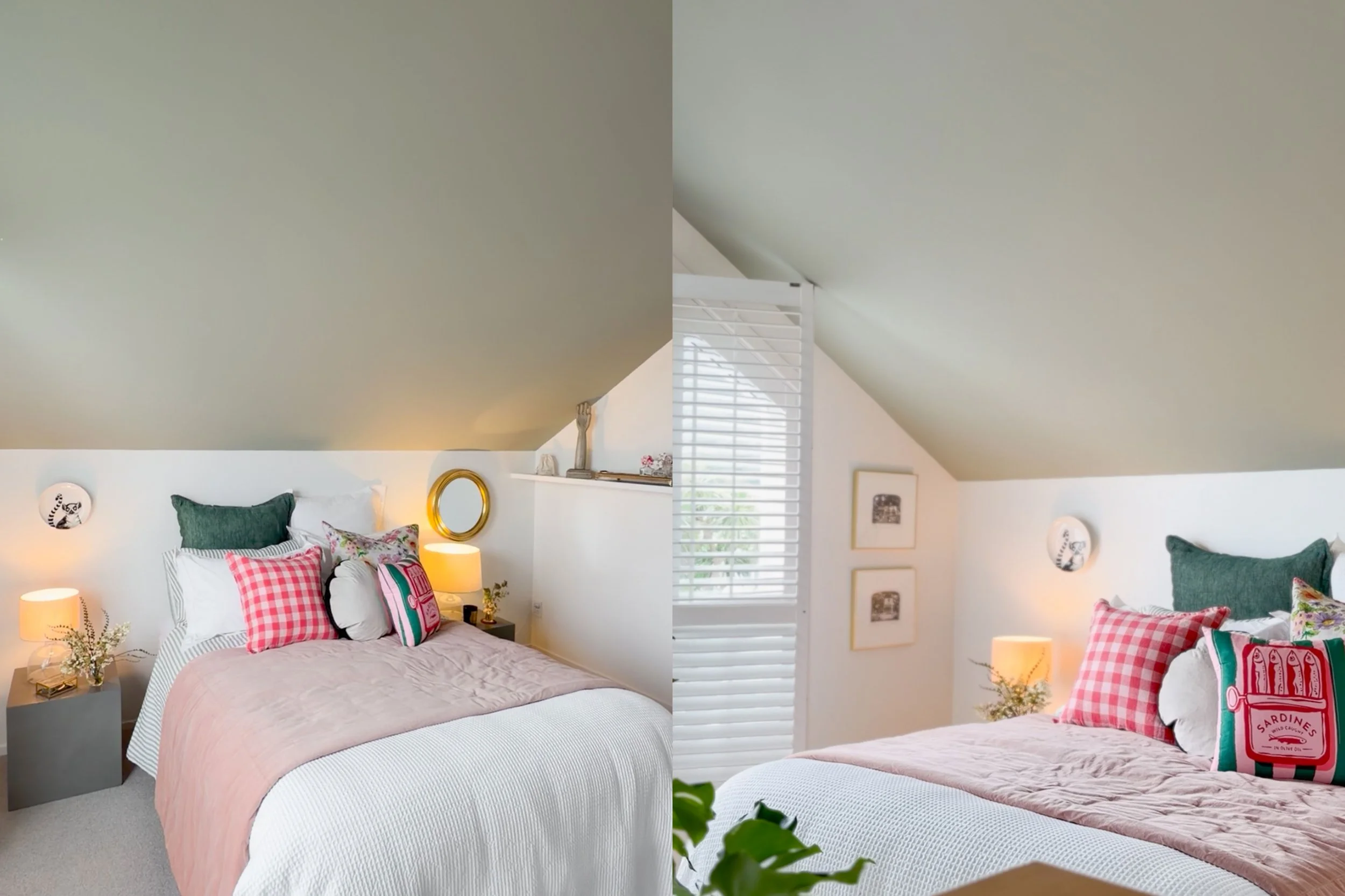
The second bedroom at 99 Pirie sits upstairs, with a lovely pitched ceiling and a rooftop views over Mount Vic, as well as a small circular window on the street facing side. This bedroom is flooded with natural light and with that pitched ceiling, it already had a very cosy and inviting feel. But, after Bella threw out the idea of painting the ceiling a more unique colour, the wheels started turning in my head.
Due to many hours scrolling on Pinterest and flicking through home/design related magazines, a colourful ceiling was something that I’d always admired in the right space. It’s such a bold statement, but once the idea had been planted, I couldn’t get it out of my head. So, the obvious choice was green! To tie into the exterior colour palette and the Forms In Nature theme, Resene Lemongrass was the perfect shade, and I can’t get over how well it turned out. We even had the trim of the circular window painted green to match.
This bedroom already had plenty of appeal and charm, but it’s now a truly unique space that envelops you in a warm sage green hug. The pops of green through indoor plants, as well as some potted plants on the window ledge tie it all together, and the styling possibilities for future owners of this home to make it their own are endless. I can definitely say that I’m now a firm fan of a green ceiling!
This colour journey at 99 Pirie Street started with an adorable Mt Victoria cottage and more creative freedom than any client has trusted me with before. The result is something that I couldn’t be more proud of, and with the help of some immaculate staging from Bridgett Popplewell, this home is a true gem and we can’t wait to show people through this Sunday.
If you like what you’ve seen so far, join us there at 1:00-1:30pm on Sunday or…