Colour Therapy
“Colour therapy-often known as chromotherapy-uses the power of colour in our everyday lives to support our mental, emotional, and physical wellbeing….” Source: Calm
Well, it’s hard to argue with that. There’s no doubt that colours can have an impact on my mood and how I feel in a space. In saying that, I also love crisp white walls so sometimes it’s hard to know whether to lean into colour or not. Typically we have stayed safe and simple with white walls in our homes and enjoyed bringing colour in through soft furnishings – the cushions, linen, throws, art – throughout the home. But in our current house we have embraced colour.

Downstairs we have gone with a different colour in each space. This was not a quick or easy process. I feel like I must have ordered just about every Resene A4 colour chart one can, and they have all been stuck with blu tack on multiple walls. Because you can see all three spaces at once from certain places, we needed the three different colours to work with each other, adding further paint charts to the mix!

Kitchen/Living
In the end we went with Resene Sakura in the kitchen/living space. Pink had been suggested. by Jason and to start I wasn’t sure. But with multiple paint charts (there are a lot of kinds of pinks), and inspiration from my pink water flask, we got just the right shade. This space always feels warm and welcoming, even on a bleak day, and in summer, when the setting sun streams into this area it positively glows!
Living Room
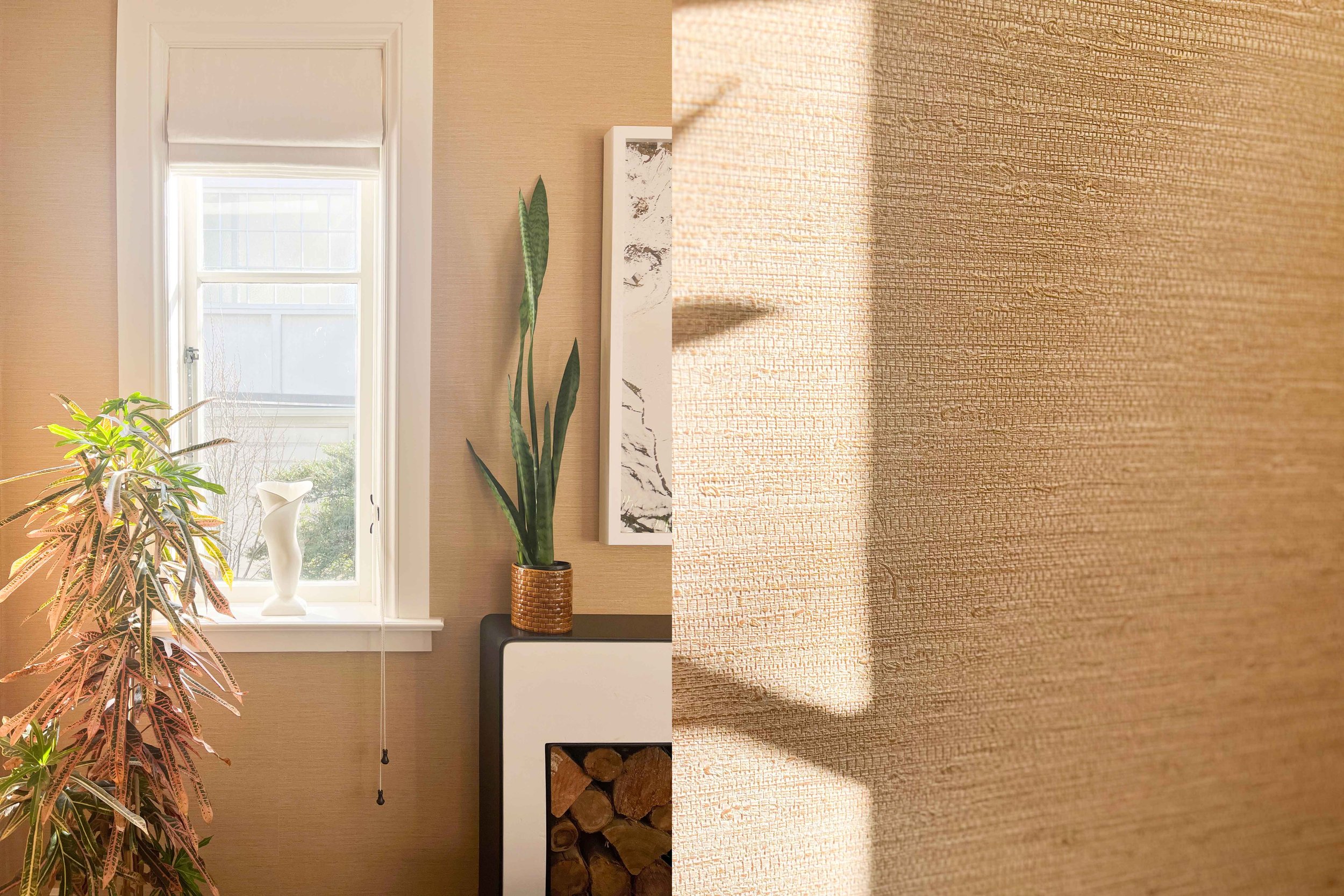
In the living room I was able to fulfil an interior dream that I’ve had for a few years which was to use grasscloth wallpaper. I sold a house on Talavera Terrace years ago, and I had always loved a golden grasscloth wallpapered room at that house and had held that image in my mind for the right time to use it. The grasscloth gives our living room a beautiful texture and at night when the light level is low it looks super luxe and warm. Thanks to Amanda and Abbey at Small Acorns for their help.
Dining Room
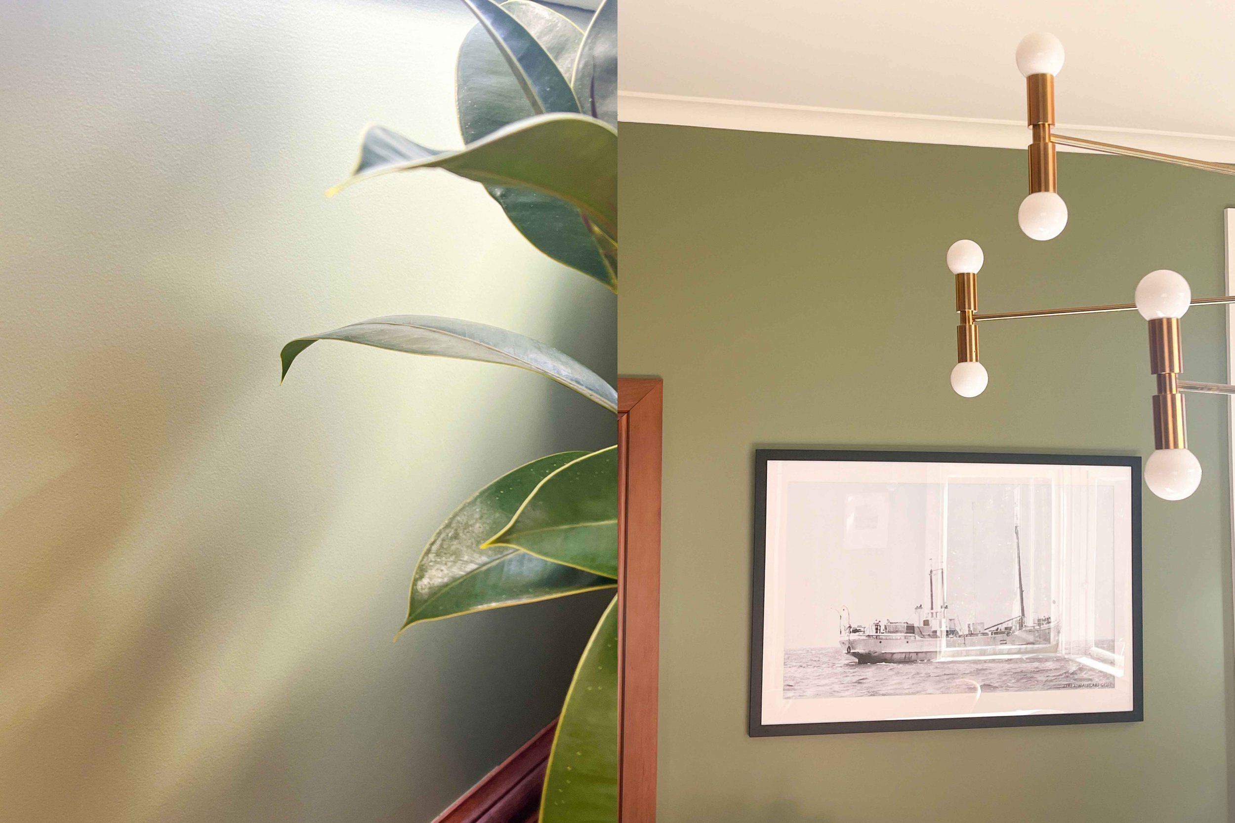
In the dining room we went with Resene Paddock. The previous owners had painted this space a dark grey, and we really loved the moody aesthetic but when needing to coordinate the three areas together the dark grey became tricky to work with. I think my love of green is pretty well documented on Instagram and we both felt that a deep green would be great for the space. A green paper shopping bag from a second hand t shirt store inspired the shade of green we wanted and Paddock was a perfect match.