Open Home Ready - 99 Pirie Street
One of the biggest concerns that sellers often express when bringing their home to the market is the amount of work that needs to be done to get their property Open Home Ready. It can be a daunting and overwhelming task, but it’s well worth it to get those eye-catching photos and encourage buyers through the door. Whether it’s more costly fixtures or small cosmetic changes, these details are what can really make your property stand out from the rest, and you don’t have to do it alone!
For our lovely client at 99 Pirie Street, getting her property Open Home Ready was something she enlisted our help with and it ended up becoming one of the most creative and enjoyable processes for us. With an interior re-paint on the cards, our client came to us with an idea to bring some personality and unique energy into her home through colour. Why paint all the walls white when you can have a bit of fun with it?!
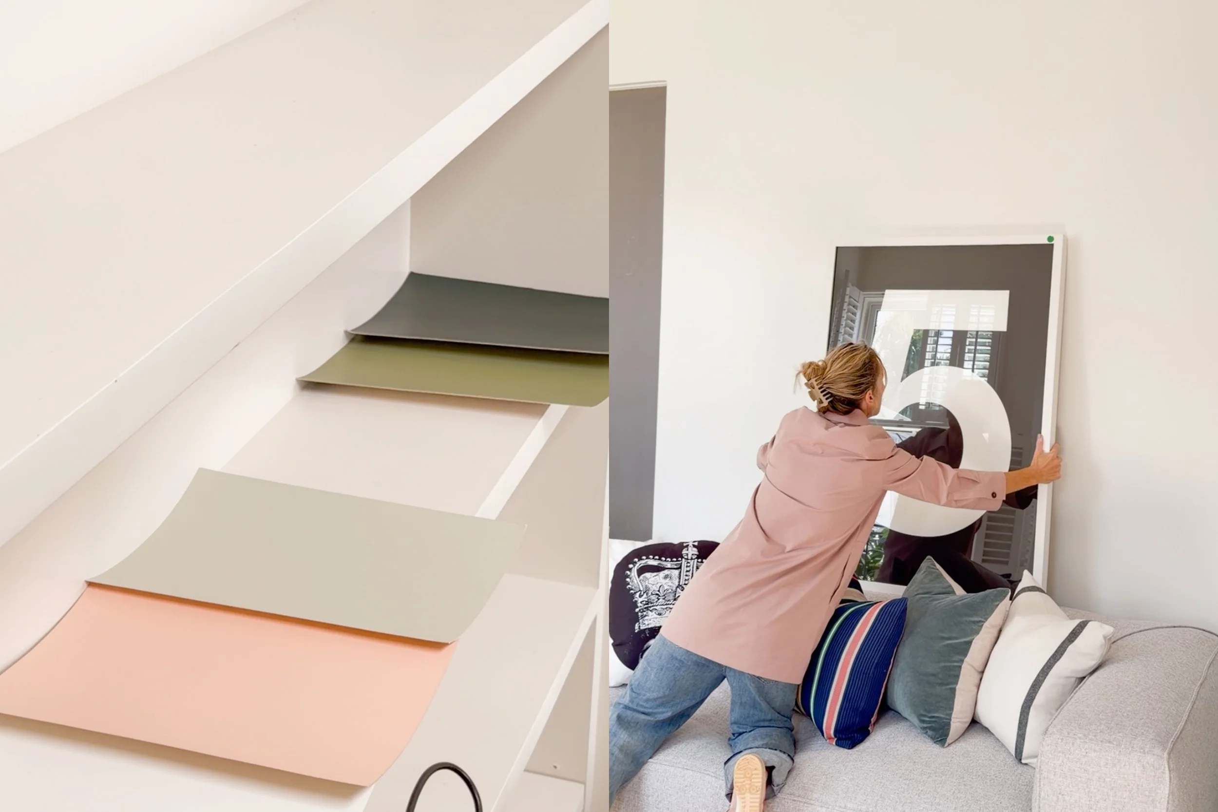
So, I sat down with a pile of Resene paint swatches and began creating a palette that would best suit this Mt Victoria cottage. If you’ve been considering a re-paint of your own home, you’re daunted by the task of getting your property Open Home Ready or you simply love a good before and after, here is the full run-down of this behind the scenes process…
First Impressions
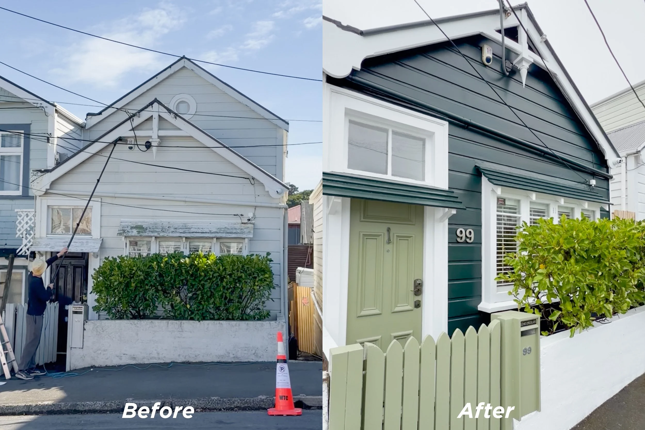
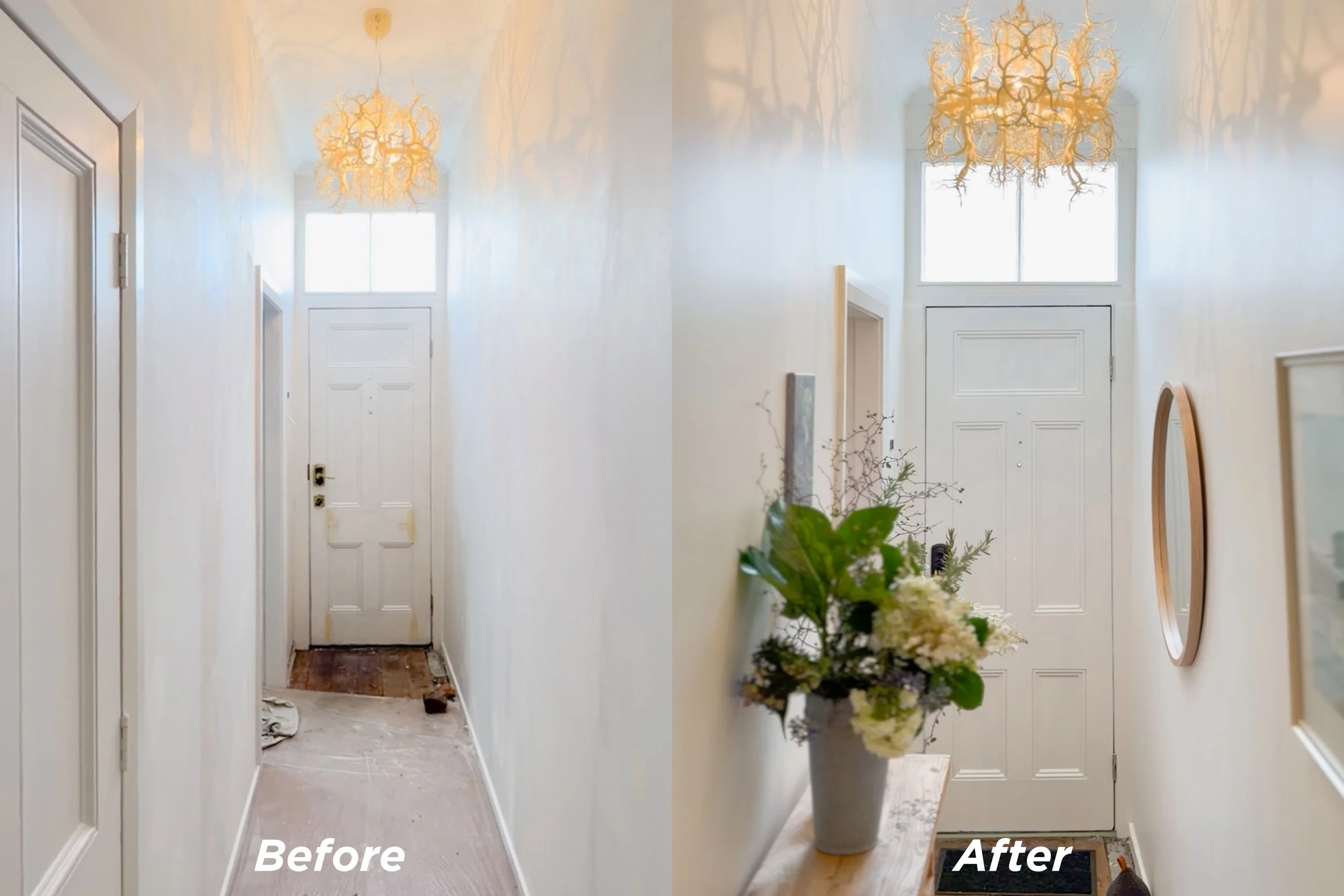
First impressions are everything, especially when it comes to property. So, creating a bold yet widely appealing exterior impression was at the top of our priority list. Mount Victoria is known for its cute villas and cottages, many painted in bright shades of pink, blue or yellow. We knew we wanted 99 Pirie Street to stand out, so taking inspiration from the Forms In Nature light fitting in the entryway, we landed on an earthy green colour palette.
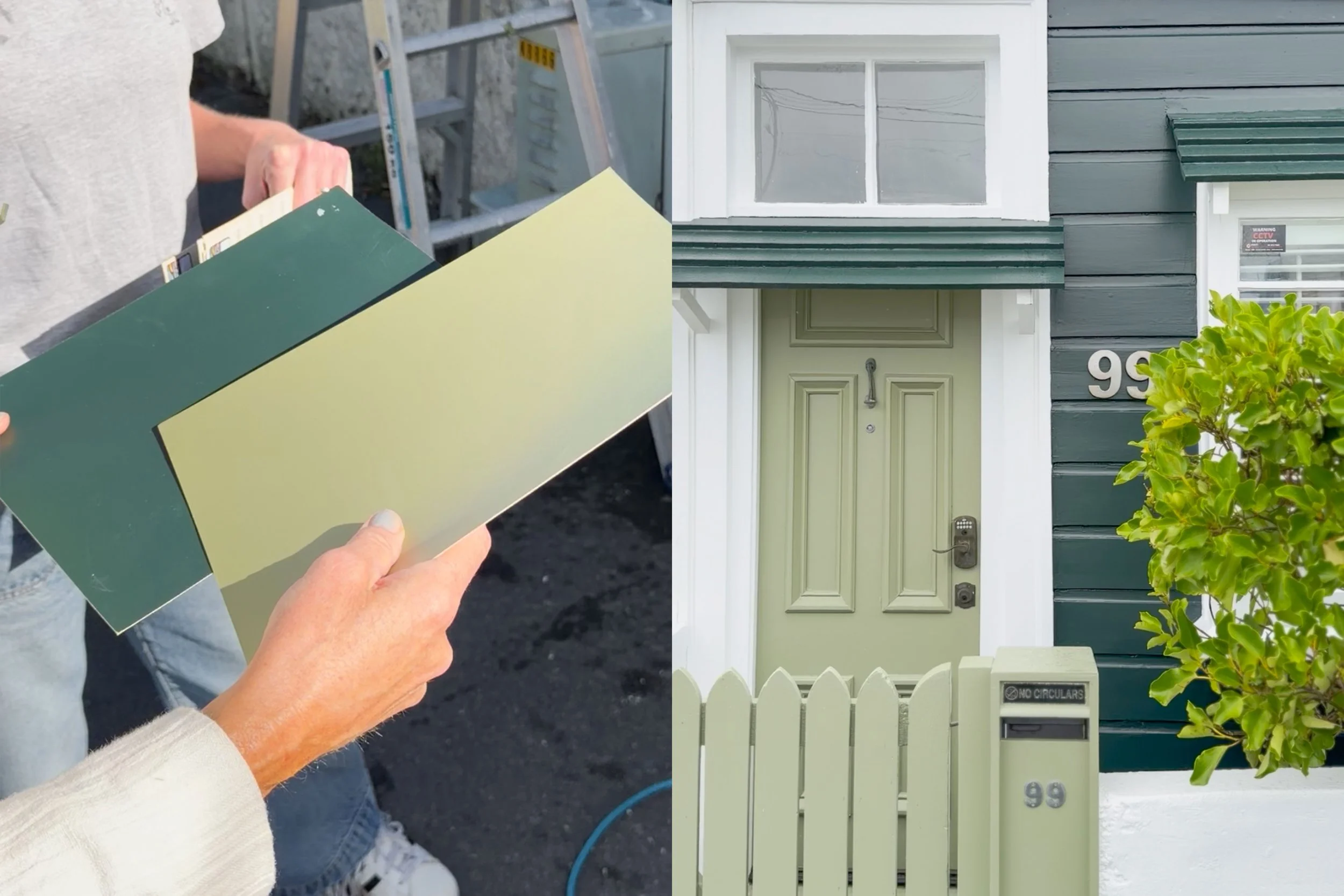
For the exterior frontage we used Resene Midnight Moss, a deep shade of mossy green which makes 99 Pirie Street pop and ties into the greenery of the town belt at the top of the hill. For the gate, mailbox and front door, we chose Resene Finch, a lighter shade of green, which complemented the darker facade perfectly. After a powerwash and some coats of paint, the exterior transformed from a cute cottage to a home that truly stands out from the rest.
Key Learning: When it comes to exterior paint, don’t be afraid to go bold. But, make sure to take your time choosing the right shades within your palette. Taking inspiration from surrounding colours helps to ensure the finished product feels intentional and will appeal to the masses.
The Front Bedroom
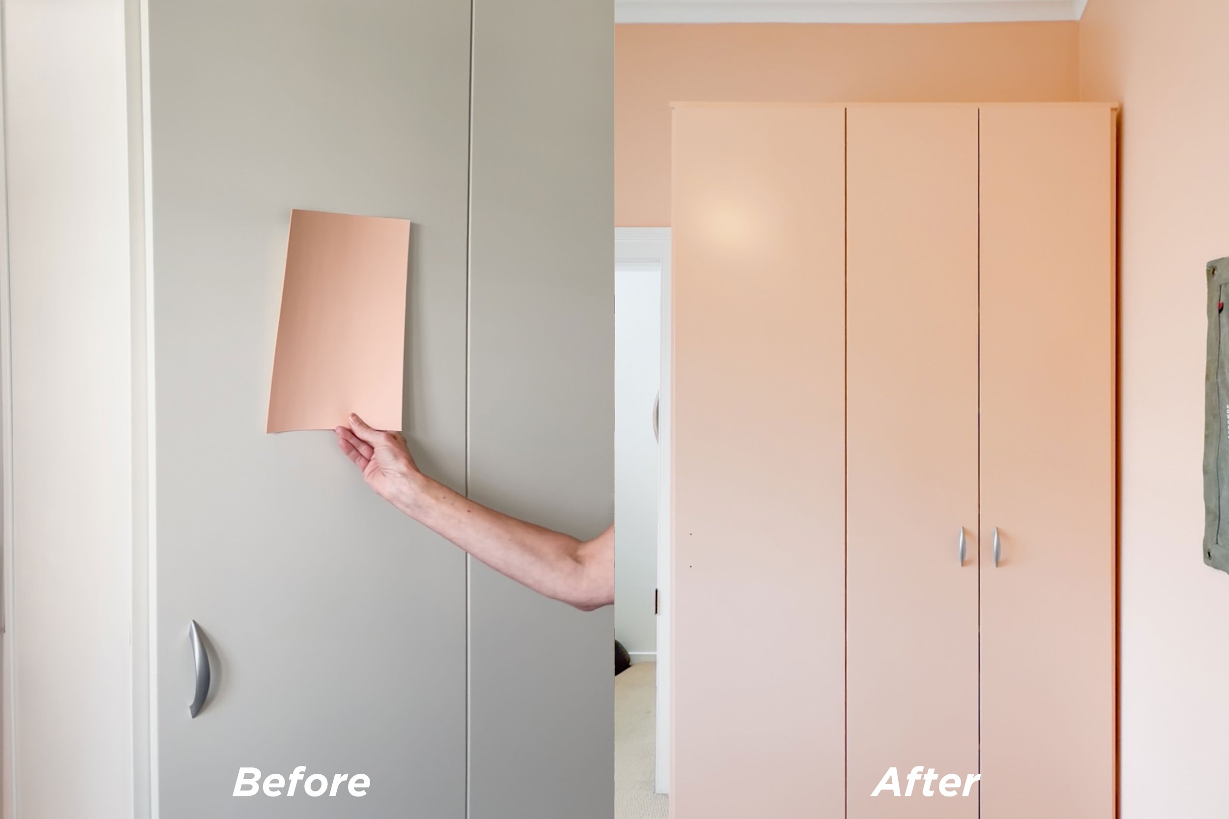
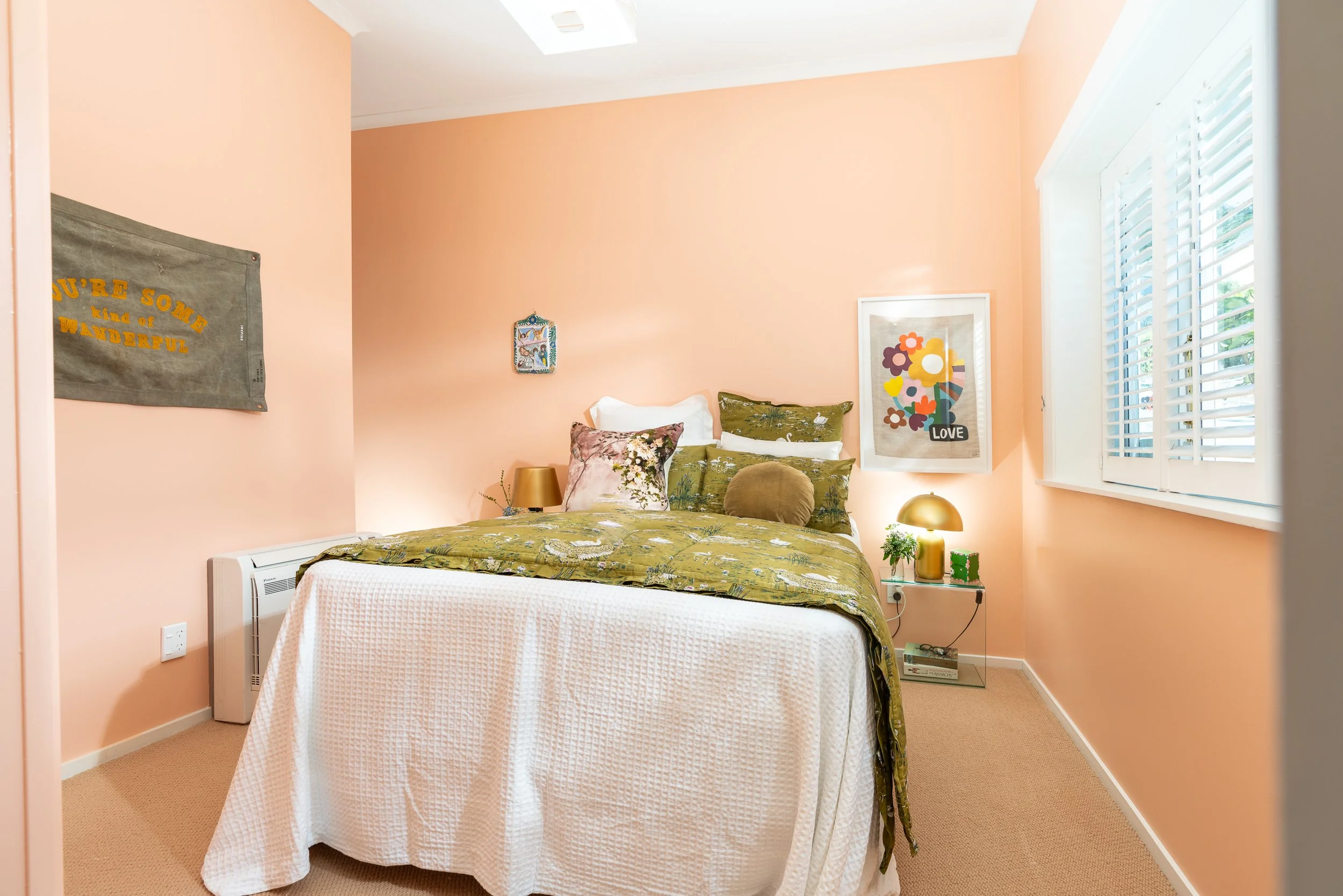
When it came to the front bedroom, which is street and South facing, I knew I wanted to bring in a bold colour, something to warm up this space that was lacking in natural light. This room became a toss up between several shades of pink, but we ended up selecting Resene Wax Flower, a warm apricot shade.
The transformation in this room was unbelievable, with the pink tones bringing so much warmth and light into this space. I even found myself double checking that I had turned the lights off thanks to the new warm glow that was emanating from this room!
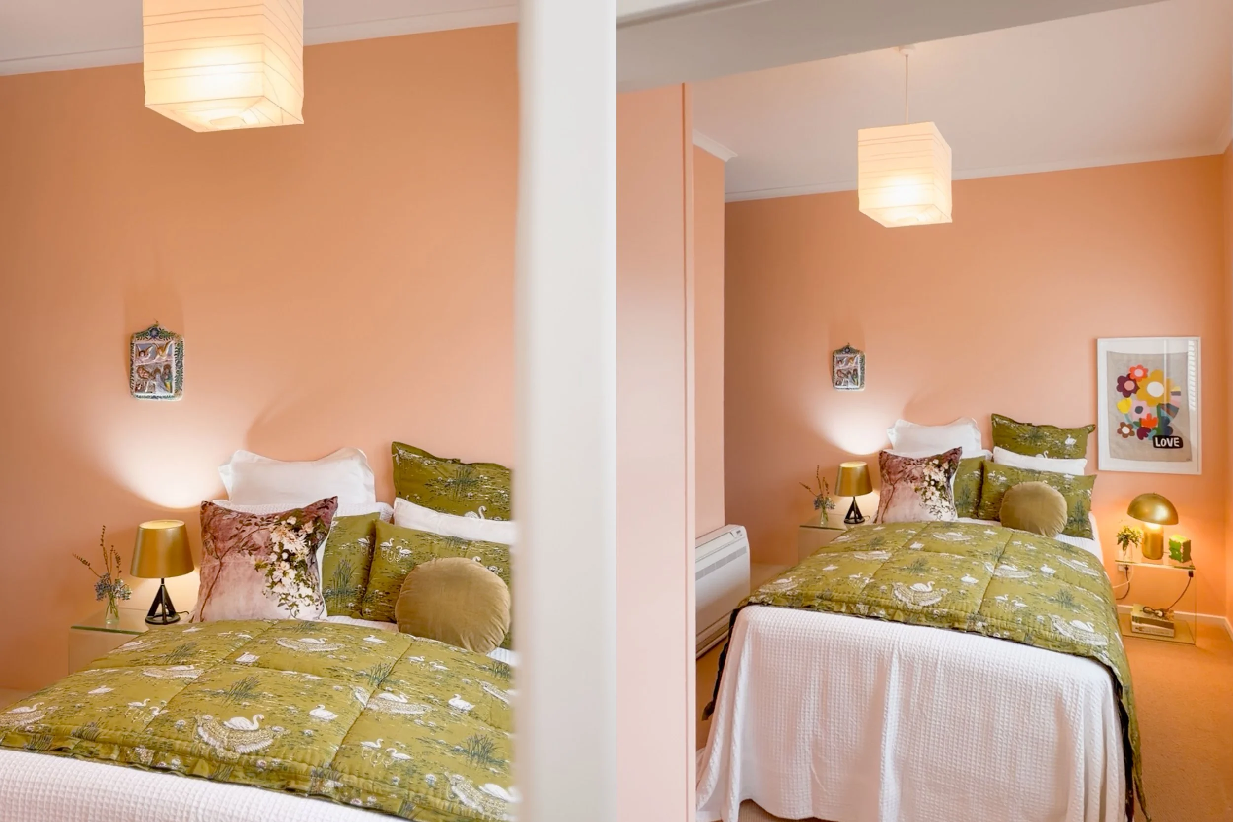
The wardrobe in this bedroom was originally a standard shade of white, so we decided to throw some Wax Flower on that too, and I’m so glad we did. By fully drenching this room in colour, the impact is undeniable, it feels intentional and as the first room buyers see after entering through the front door, it’s certainly eye-catching!
Key Learning: Consider how a space is impacted by natural light throughout the year to find a colour that will enhance the space. If you’re torn between a feature wall or full colour drench, go bold! The final result will feel more intentional.
The Upstairs Bedroom
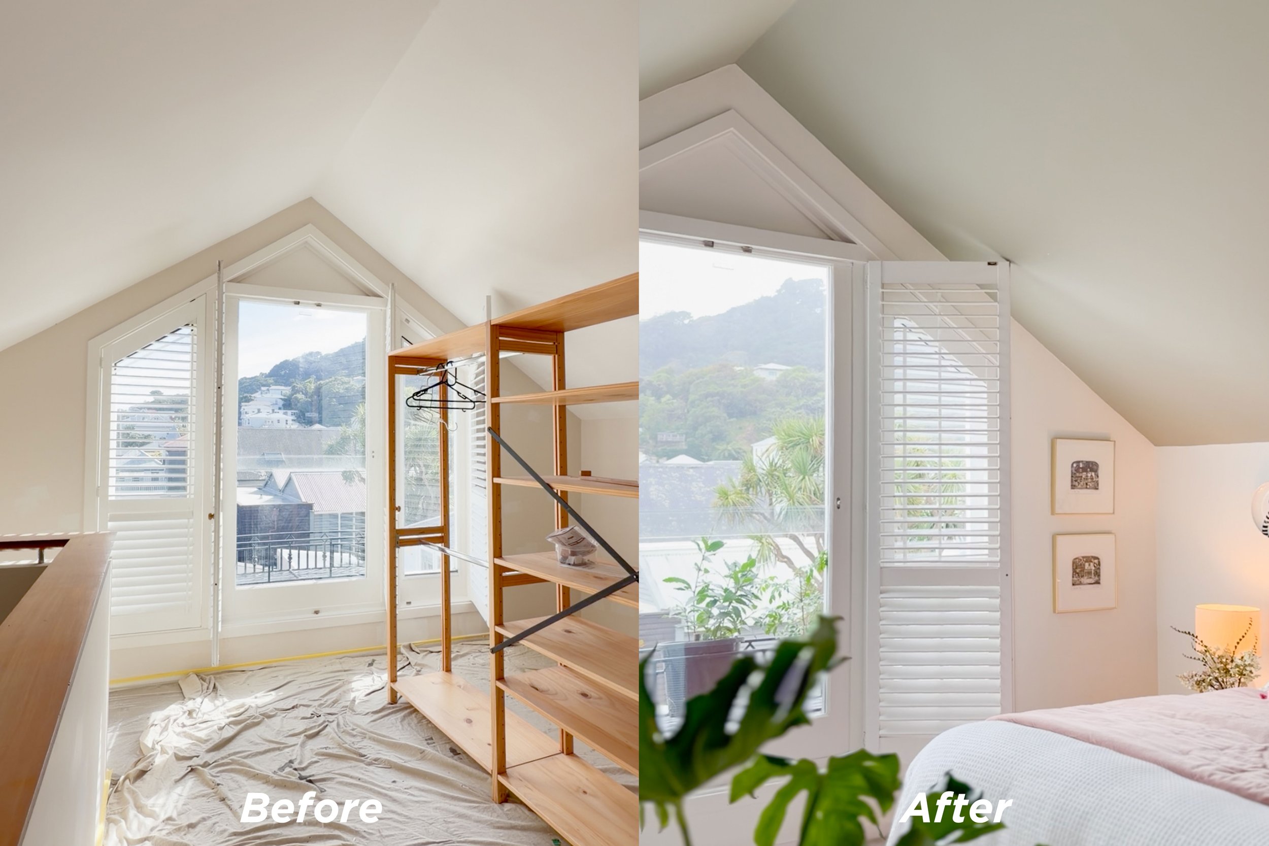
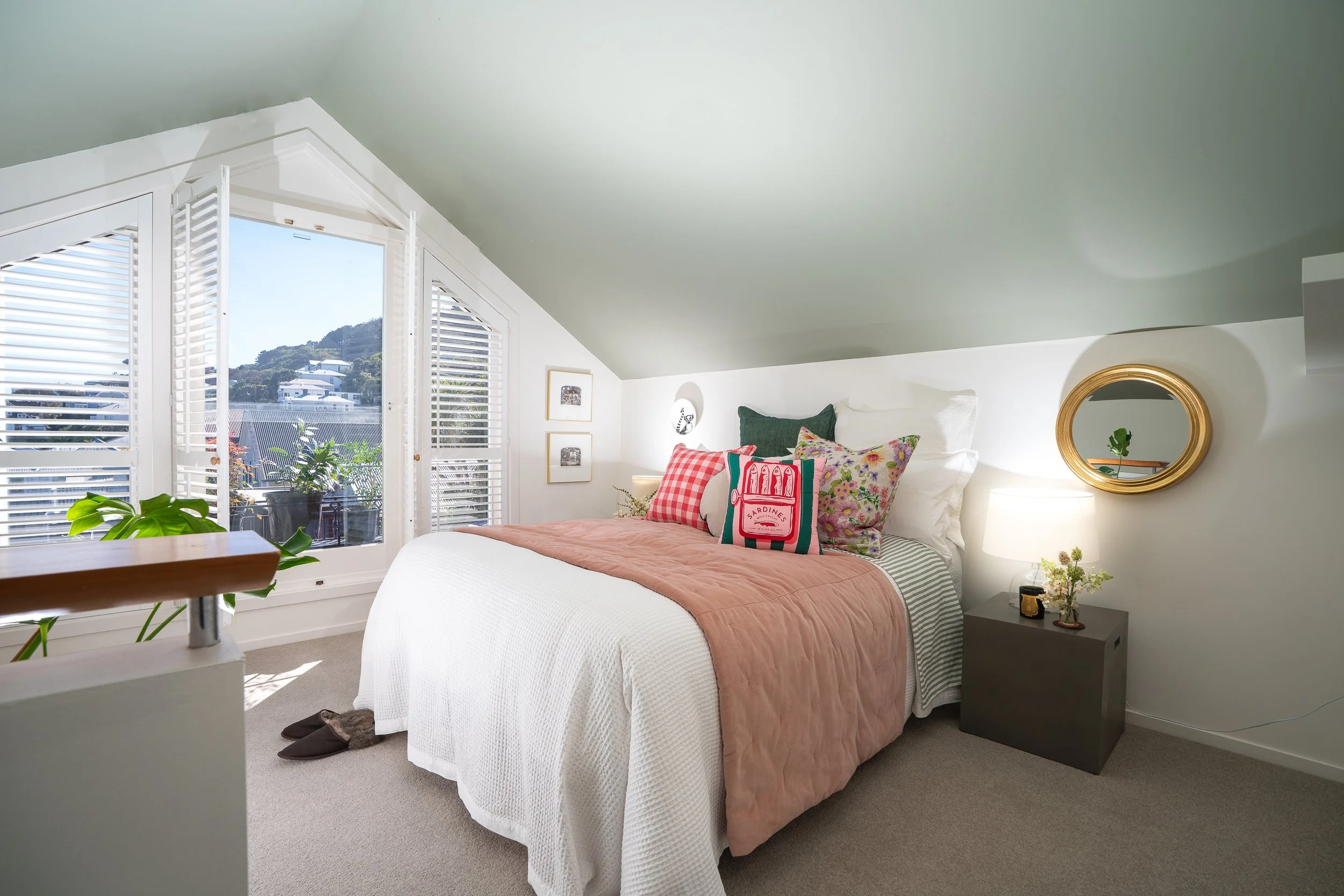
The upstairs bedroom at 99 Pirie Street boasts a large window, letting in plenty of natural light, as well as a gorgeous pitched ceiling, giving this space a cosy, welcoming vibe. We initially considered opting for a fresh coat of white paint in this room and calling it a day. But once Bella threw out the idea of painting the ceiling green, I couldn’t get it out of my head.

This was definitely our riskiest choice, but it paid off, transforming what was already a lovely bedroom into a sanctuary full of personality and ready for a future buyer to make it their own. We also decided to paint the small circular window frame green to tie it all together and make this quirky window a true feature.
Key Learning: Think outside the box, a painted ceiling may feel like a risky or polarizing decision, but with the right shade, it can be so impactful. Consider where else in the space you can tie that colour in, through additional painted surfaces, soft furnishings or artwork.
Details
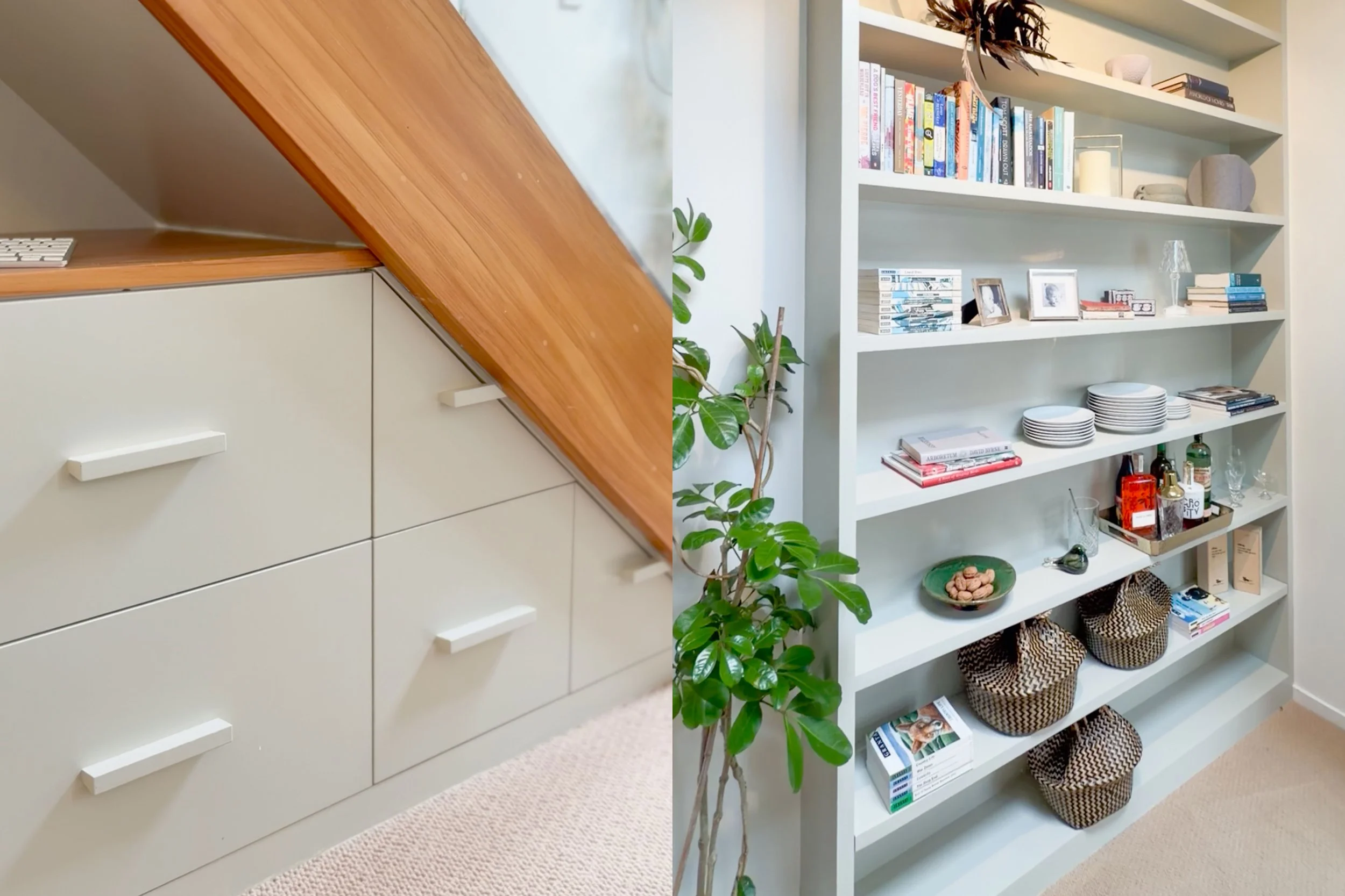
With a large built-in shelf in the living/dining area and built-in storage underneath the stairs, we had plenty of canvas for our green colour palette. Whilst it may feel like a small detail, painting these surfaces a subtle shade of green helped tie our palette together and create a consistent thread throughout the home. I was especially pleased with how the green shelf turned out, making this otherwise ordinary storage element into a subtle feature.
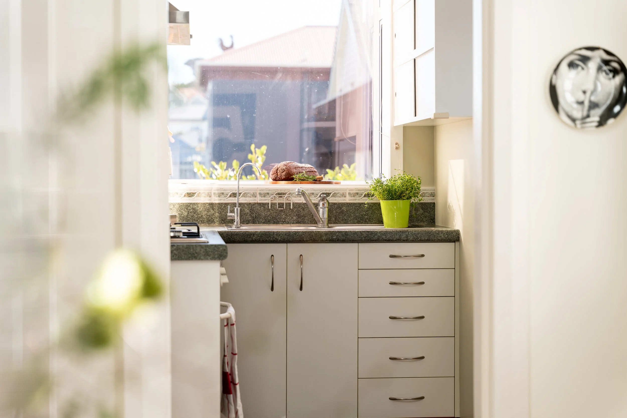
We also decided to carry this light green shade into the kitchen, making sense of the existing benchtops. This compact kitchen now has a distinct vibe and ties into the rest of the home perfectly.
Key Learning: Create a consistent colour story or thread throughout your home, working with a well considered palette will ensure each space ties into the next.
Staging
The final piece of the puzzle was all down to the wonderful Bridget at POP Interiors. With a truck full of furniture, cushions, kitchenware and artwork, she got to work staging 99 Pirie Street. Bridget had been involved in the paint selection process too, so she knew exactly which pieces would make each of these spaces pop. The results speak for themselves, Bridget is truly a design genius and her eye for detail made 99 Pirie Street feel like a home that had been lived in, something that’s hard to do with a vacant property!
In the front bedroom, she chose earthy green shades in the bedding and soft furnishings, which complemented the pink walls perfectly. With a nod to our initial inspiration of the Forms In Nature light fitting, she incorporated plenty of plants, fresh flowers and earthy tones throughout the property and her styling on the green shelving made what would otherwise be a forgotten element into a design feature.
Key Learning: Whether you’re getting your property staged or working with existing pieces, being intentional with furnishings and decor is essential for getting your property Open Home Ready. Less is more, but buyers are more likely to connect with a home that feels truly lived in, creating spaces that they can picture their own family enjoying.
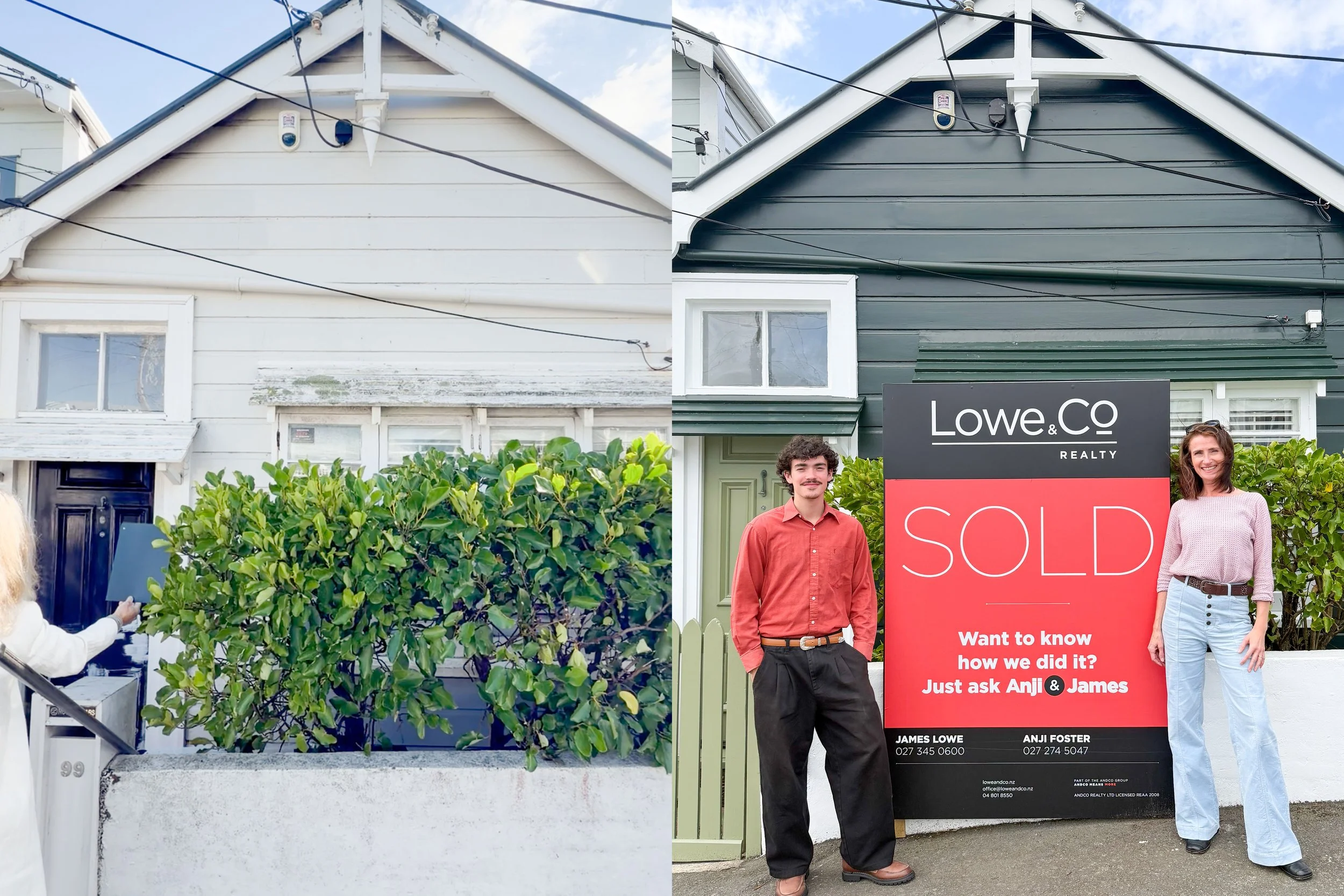
Getting 99 Pirie Street ready to hit the market was such an enjoyable and creative process and the results speak for themselves with a big red SOLD sign now sitting proudly outside this home. If you’d like some advice on getting your own property Open Home Ready, I’d love to chat.