Bring Back Colour!
It’s no secret that I’m a fan of being bold with colour when it comes to interior design. From the green ceiling at 99 Pirie Street to the pink walls in our own living room, life is too short to be afraid of taking a few design risks! Because when they pay off, they can transform a space into a magazine-worthy design moment and make an everyday space like a kitchen or bathroom a piece of art that is uniquely yours.
It’s taken me some time to be confident enough to splash pink paint on the walls, through trial and error (including a DIY turquoise painted floor-not the best idea) I’ve found a happy middle ground between trendy and timeless when it comes to colour in our own home.
When it comes to decorating or renovating a home, most of us can’t afford to splurge on the help of an interior designer, whose very job is to know which colour combinations will work best in a space. But with tools like interior design magazines, social media and Pinterest at our disposal, creating a colourful space that is unique to you and your family is easier than ever.
So, today I wanted to share some of my favourite interior design colour combinations, all of which I believe are truly timeless. So whether you’re looking for some inspo to repaint or redecorate a space in your own home or you simply love perusing images of stylish spaces, read on…
01 - A Pop of Electric Blue
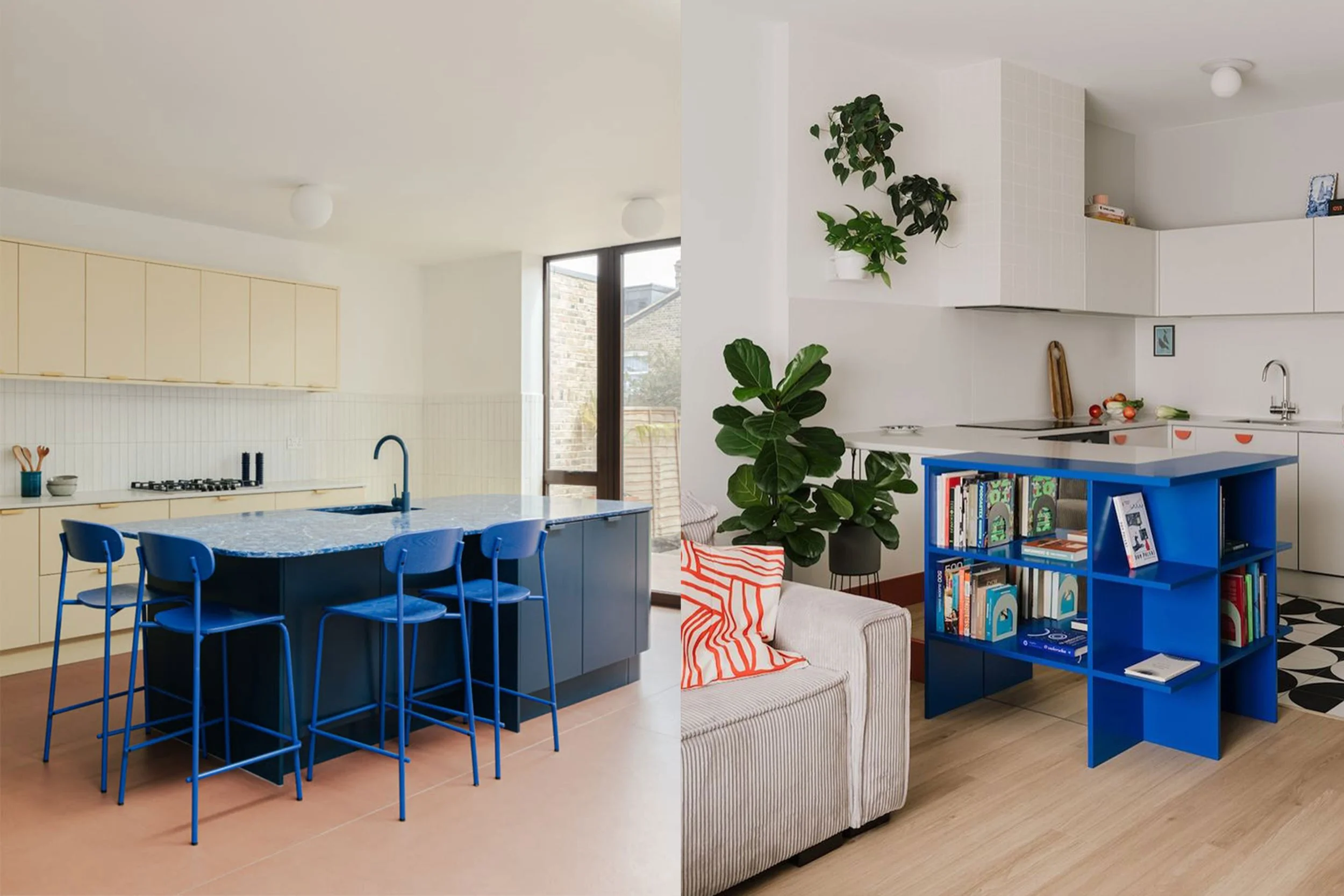
A pop of electric blue can bring energy, life and a modern edge to a space. Its bold and vibrant tone naturally draws the eye, making it perfect for accent pieces such as cushions, artwork, furniture, or statement walls.
When admiring the use of this trend on Pinterest, I noticed that it works best in small, intentional doses. Such a bold colour can be jarring when overused, but when dotted around in a space it immediately gives that high-end design feel. This shade is best used with neutral colours like white, grey, beige, or black, as it creates a striking contrast without overwhelming the space.
02 - Sage Green, Blush Pink & Terracotta
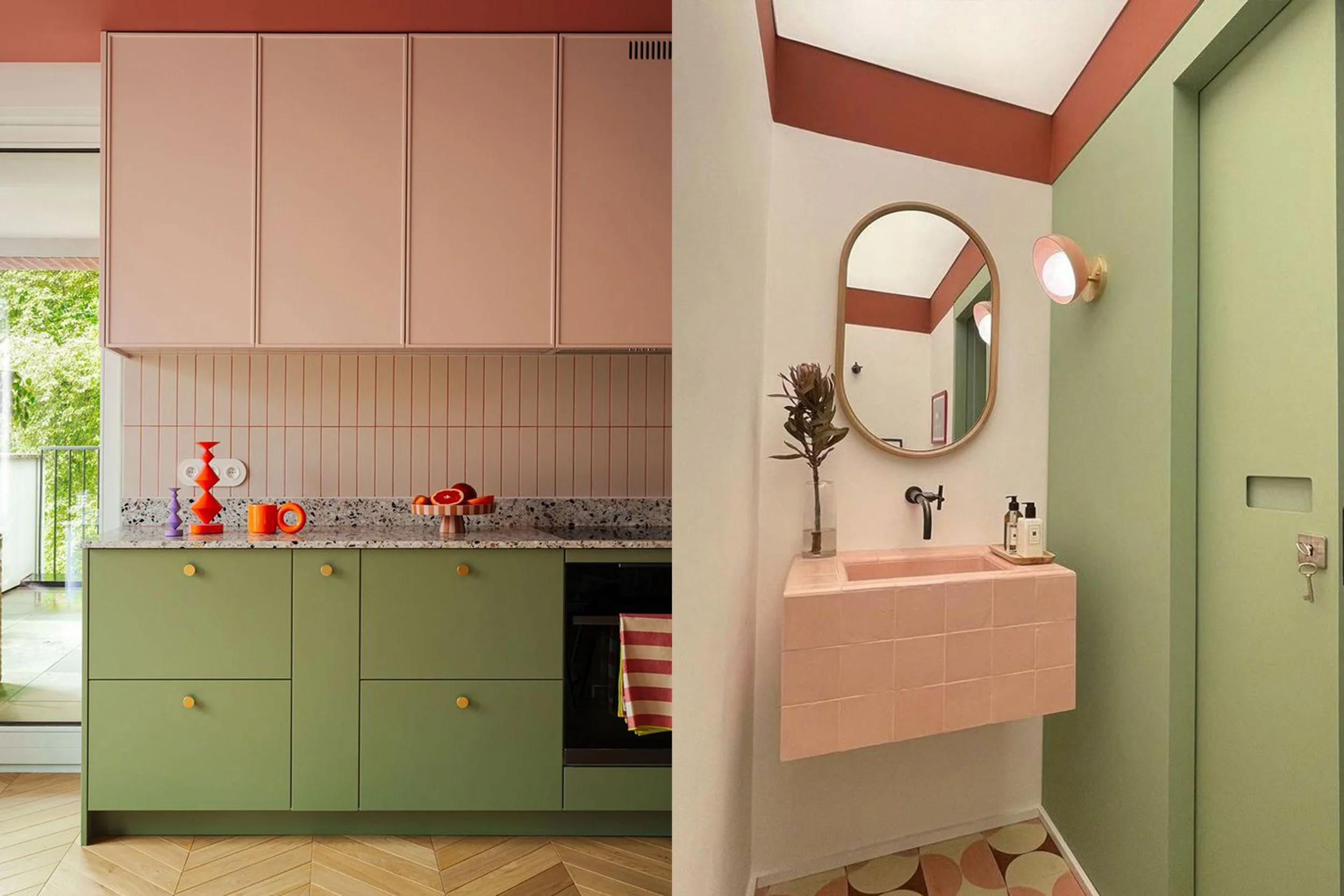
This classic mid-century inspired palette is one of my favourites and with its retro influence, it’s definitely timeless. The combination of these shades creates a balanced palette, with sage green bringing a soft, natural quality, while blush pink introduces warmth and terracotta grounds the palette with rich earthy tones.
Some of the best ways to find colour palette inspiration is through nature and this combo is a great example of this, with a Californian desert feel that can translate beautifully in just about any space. This colour combination is perfect when working with existing terracotta tiles, something that can limit your palette when decorating on a DIY budget.
03 - Butter Yellow & Baby Blue
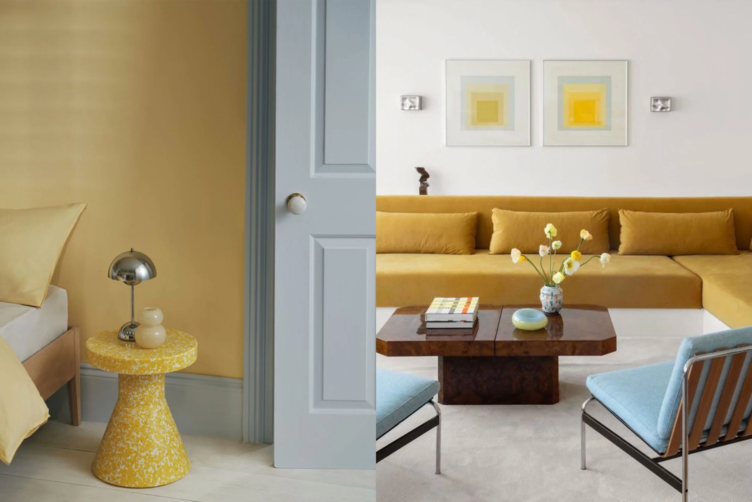
This pairing is one I’ve seen pop up online a lot recently, and for good reason! The combination of light pastel shades of yellow and blue bring warmth and vibrance to a space, whilst creating the perfect base palette to work from. Simply adding a pop of green through plants or some pink in soft furnishings can elevate this palette even further.
This combination works especially well in modern, coastal, or vintage-inspired interiors, helping rooms feel bright, peaceful, and full of character without appearing overpowering.
04 - A Pop of Red
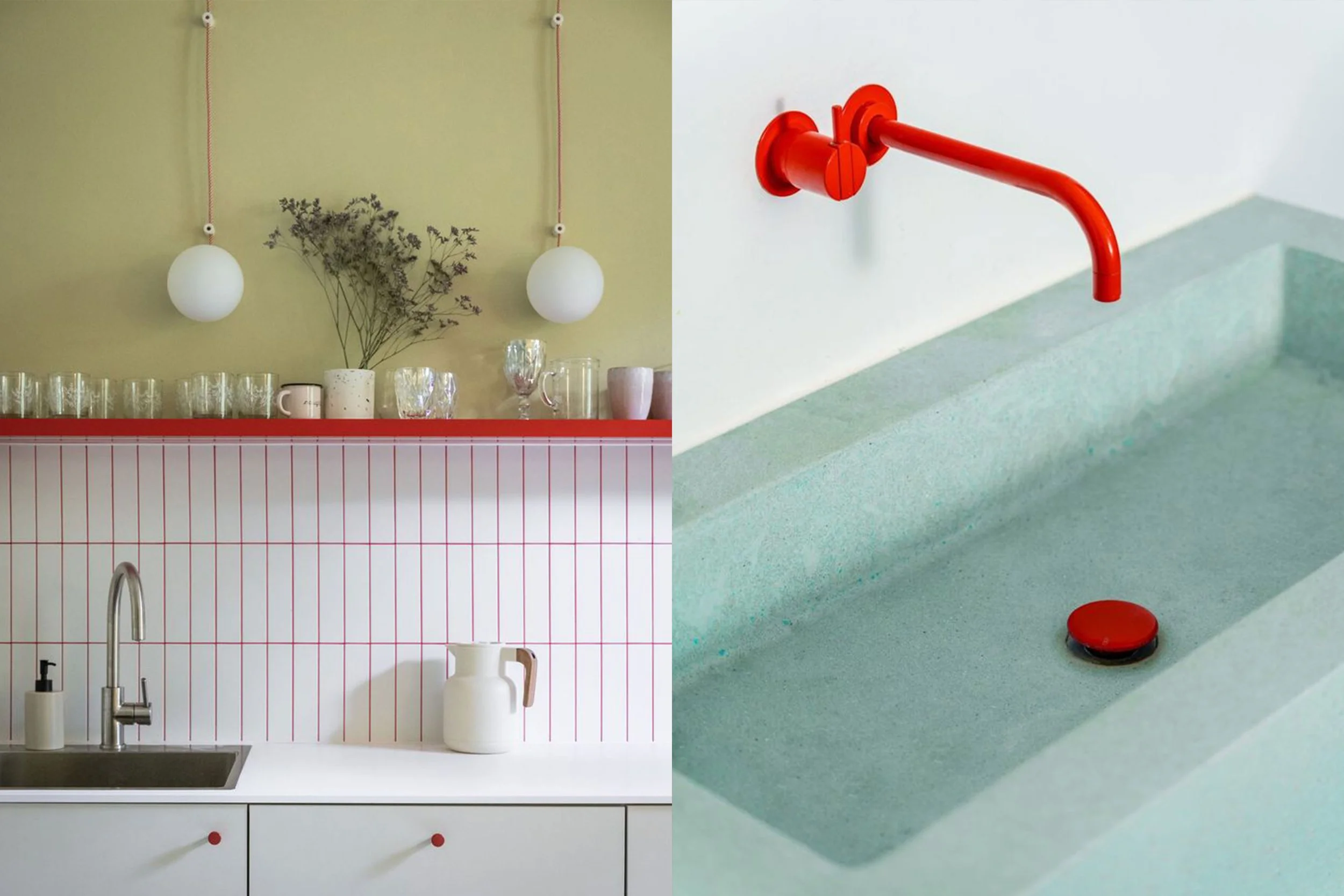
Red has always been a colour that I’ve shied away from using when it comes to interior design, its bold nature can make it a tricky colour to work with. But, much like the pop of electric blue, when used in an intentional and minimal way it can take an interior space to the next level
As a bold and confident colour, red naturally draws attention, making it perfect for accent pieces like artwork, rugs, or statement furniture. When used thoughtfully, even small touches of red can create contrast and depth, especially in neutral or minimalist interiors. I especially love the use of it in unexpected places, like the toe kick in a kitchen, tile grout or cupboard handles - so fun!
05 - Blush Pink & Natural Wood Tones
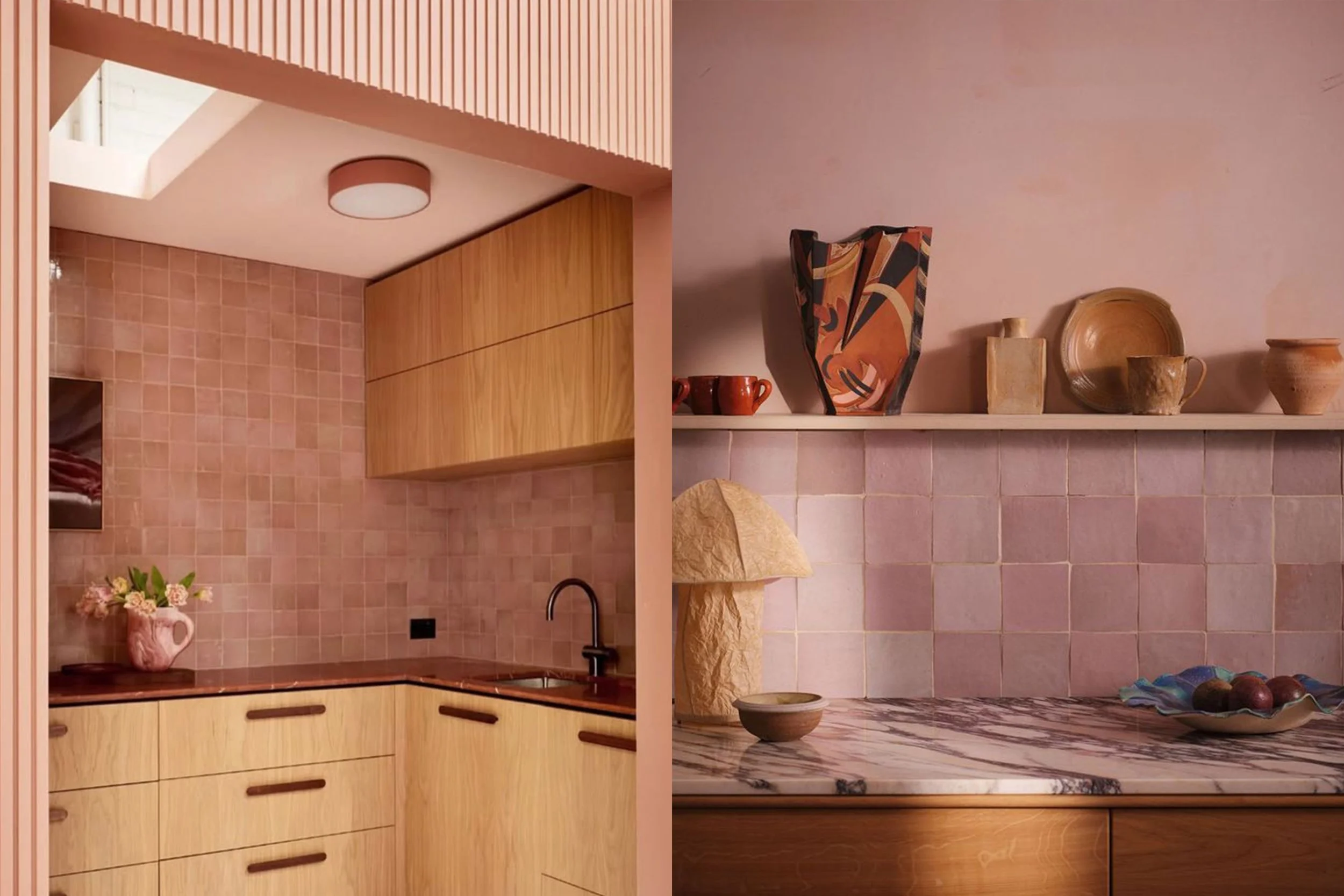
Another classic combination, blush pink and natural wood tones work beautifully together to create a soft, warm, and timeless aesthetic. The warmth that comes from both of these elements can work perfectly in a space that is lacking in natural light, as well as providing a great base to bring additional colours into through plants, artwork and soft furnishings. This palette would be the perfect place to introduce that pop of electric blue!
06 - Chocolate Brown & Blue
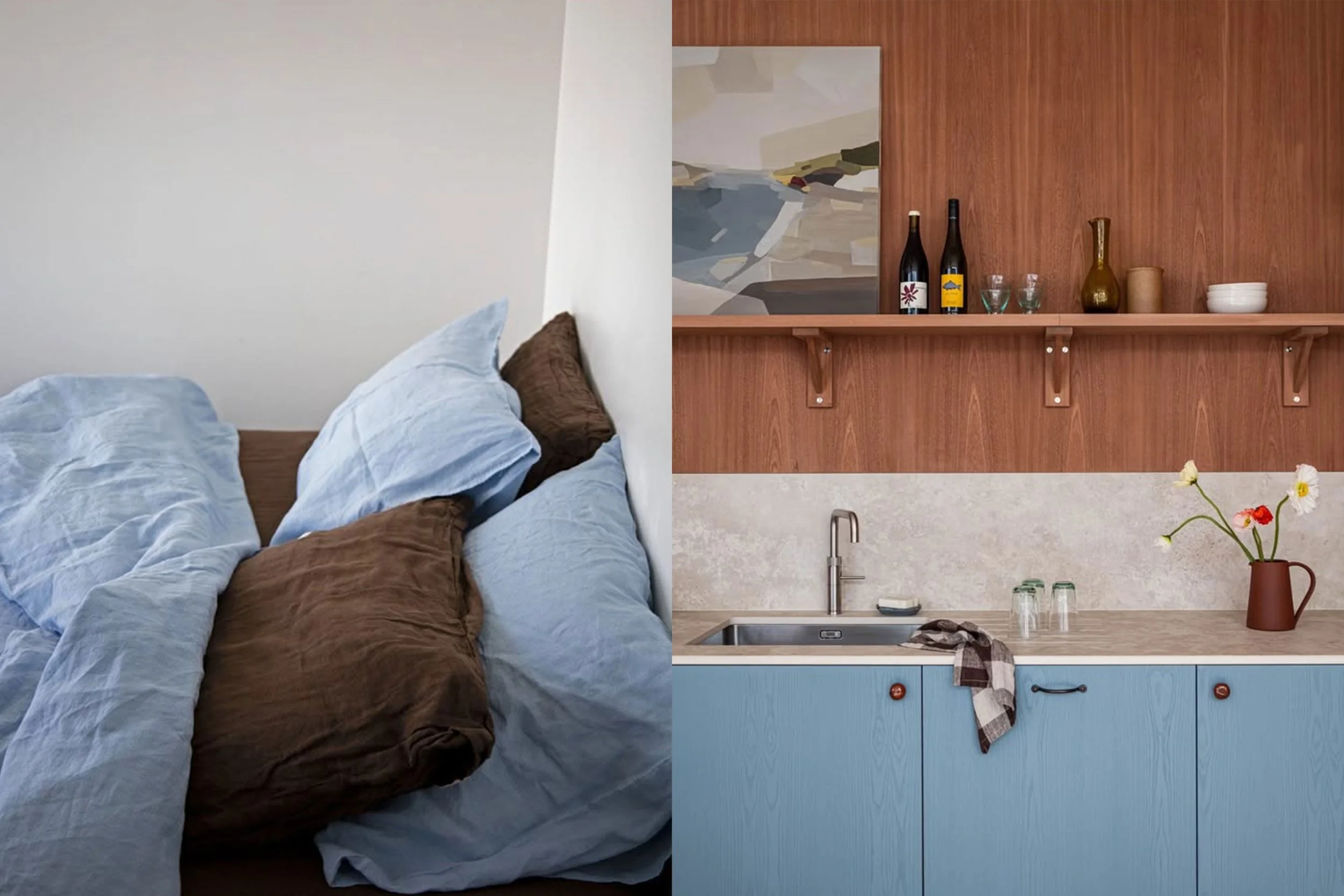
This combination is another beautifully timeless one, inspired by classic mid-century style. The balance between the warmth of a deep chocolate brown shade and a cool toned blue is so pleasing to the eye and the perfect base palette to build from.
I especially love the use of this colour combo in bed linen, it’s not something you see often but the calming nature of these colours works perfectly for a relaxing bedroom sanctuary.